What is z-index in CSS?
z-index is a CSS property that controls the stacking order of positioned elements. It determines how elements are layered and displayed on top of each other when they overlap in a web page's layout. The z-index property only works on elements with a specified position value of absolute, relative, fixed, or sticky.
Common reasons:
If the z-index property is not working as expected in your CSS, there are a few common reasons and solutions you can check:
1. Position Property: The z-index property only works on positioned elements (i.e., elements with position set to absolute, relative, fixed, or sticky). Make sure the element you want to apply z-index to have one of these position values.
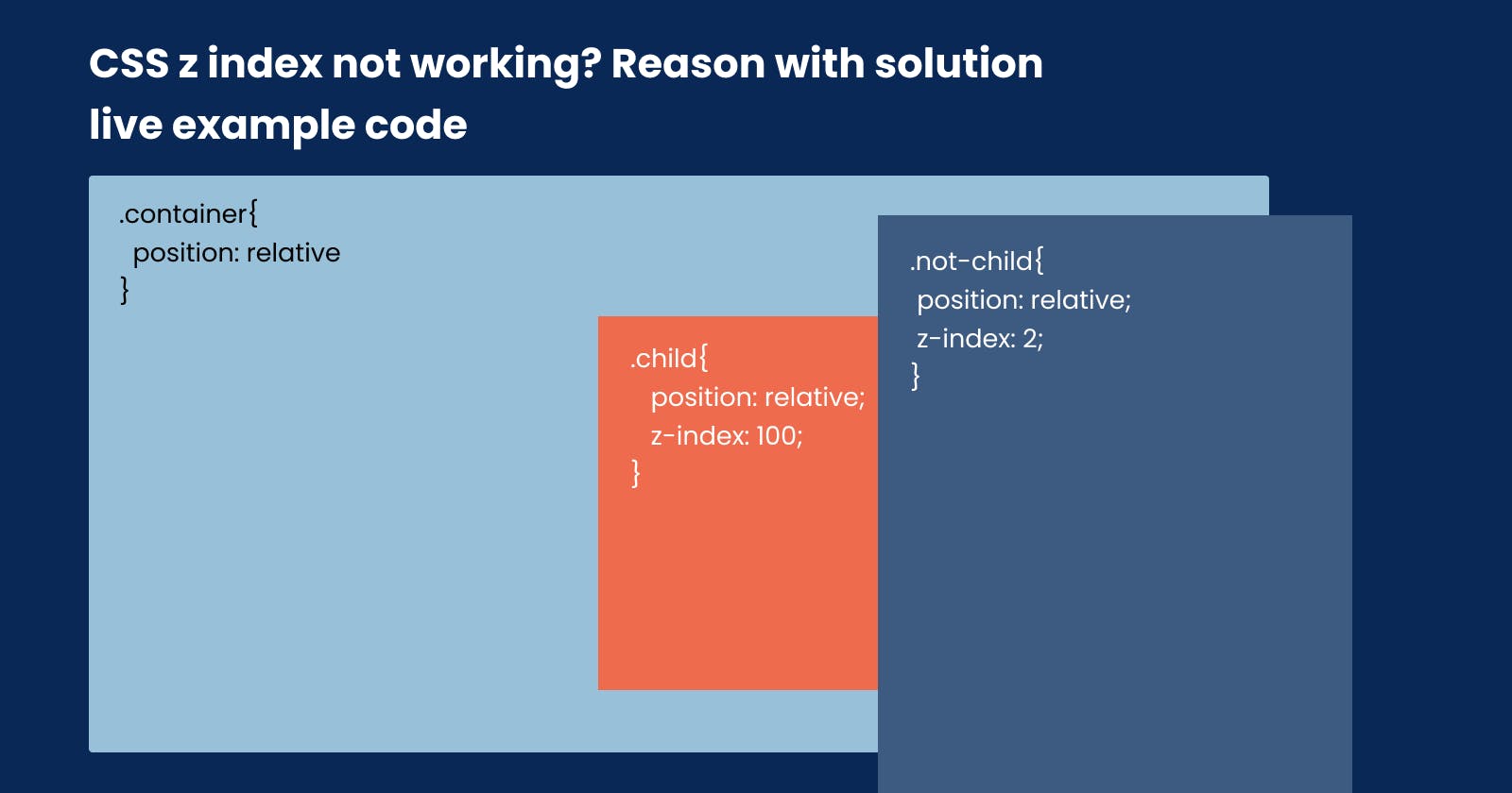
2. Parent Elements: The z-index property is relative to the stacking context of the parent elements. If the parent elements do not have a specified z-index or position property, the z-index of the child may not behave as expected. Check the parent elements to ensure they also have appropriate z-index or positioning.
3. Order of Elements: If you have multiple elements with different z-index values, the stacking order will be determined by the order of the elements in the HTML document. Elements declared later in the document will be displayed on top of earlier ones, regardless of their z-index values. Make sure the stacking order is as desired.
4. Overlapping Elements: If the elements are not overlapping, the z-index property may not seem to work. Ensure that the elements you want to control the stacking of are indeed overlapping each other in the layout.
5. Auto Stacking Context: Some elements like flex containers with z-index: auto will create a new stacking context for their children, isolating them from other stacking contexts. This can affect how the z-index works for the children. In such cases, consider using a different z-index value or changing the stacking context.
6. Transforms and Filters: Elements with CSS transforms or filters applied to them create a new stacking context and can affect how z-index works. In some cases, this can lead to unexpected results. If you're using transforms or filters, check if they are interfering with the stacking context and adjust as needed.
7. Check for Conflicts: Make sure there are no conflicting z-index values or CSS rules that might override the intended behaviour.
8. Global z-index Scaling: Sometimes, third-party libraries or CSS frameworks might set a global z-index value, which can interfere with your specific use cases. Check for any such global styling that might be affecting your component.
9. Test in Different Browsers: Browser inconsistencies can also impact how z-index is interpreted. Test your layout in different browsers to ensure consistent behaviour.
By reviewing these points and troubleshooting your CSS, you should be able to identify and resolve the issue with the z-index property not working as expected.
Bonus point
This above is a common reason, we will fix it in CSS. but, if an element has a position: fixed inside we show/hide any popup, or slider element also has position: fixed In this case CSS z-index will not work.
For example, refer the below images
Image 1:
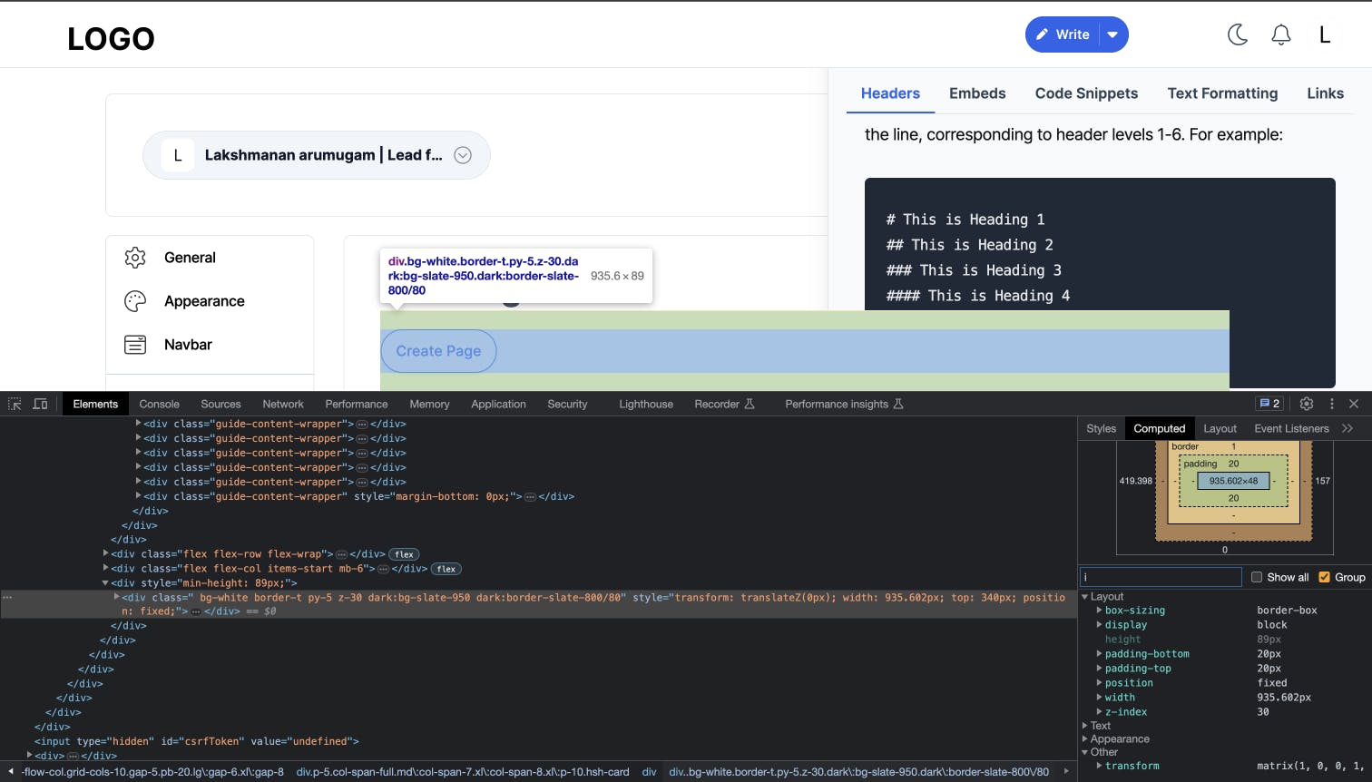
Image 2:

Image 1 has position fixed with z-index: 30 value. Meanwhile, image 2 also has a position fixed with z-index: 50
Technically Image 2 slider must come to the front of the Image 1 footer action.
Reason:
When an element creates a stacking context, it will be stacked relative to its siblings within that context. Elements inside a stacking context are independent of elements outside it when it comes to z-index stacking order.
For example, if an element with a higher z-index value is inside a stacking context, it may still be behind an element with a lower z-index value that is outside that stacking context. The stacking context creates a separate layering group and elements inside it only interact with each other for z-index ordering.
Solution: Move the content outside of the content parent, and into the main stacking context of the page using the portal.
What is a portal?
The concept of a portal in web development refers to a technique that allows rendering a component's content outside its parent component's DOM hierarchy. In other words, it enables you to render elements in a different part of the DOM tree, even outside the container that the component is defined in, while still maintaining the benefits of the component's lifecycle and state management.
Portals are particularly useful when creating UI elements that need to overlay on top of the existing content, such as modals, tooltips, popovers, dropdowns, and notifications. Instead of nesting these elements deep within the DOM tree, which can cause z-index issues and layout complexities, portals offer a clean and efficient way to render them at the top level of the DOM.
Real-time example(React)
Let's create a simple example of using a React portal with CSS to display a modal overlay.
1. Create the Modal Component:
Create a new file called Modal.js and define the Modal component:
import React from "react";
import ReactDOM from "react-dom";
import "./Modal.css";

const Modal = ({ children, onClose }) => {
  return ReactDOM.createPortal(
    <div className="modal-overlay">
      <div className="modal-content">
        {children}
        <button className="close-button" onClick={onClose}>
          Close Modal
        </button>
      </div>
    </div>,
    document.getElementById("modal-root")
  );
};

export default Modal;
2. Create the Modal.css File:
Create a new file called Modal.css in the same directory and add the following CSS styles:
/* Modal.css */
.modal-overlay {
  position: fixed;
  top: 0;
  left: 0;
  width: 100%;
  height: 100%;
  background-color: rgba(0, 0, 0, 0.7);
  display: flex;
  justify-content: center;
  align-items: center;
  z-index: 1000;
}

.modal-content {
  background-color: #fff;
  padding: 20px;
  border-radius: 8px;
  box-shadow: 0 2px 4px rgba(0, 0, 0, 0.2);
  max-width: 400px;
  width: 80%;
  text-align: center;
}

.close-button {
  margin-top: 20px;
  cursor: pointer;
  background-color: #007bff;
  color: #fff;
  border: none;
  padding: 8px 16px;
  border-radius: 4px;
}
3. Use the Modal Component in App.js:
Now, let's use the Modal component in the App.js file:
import React, { useState } from "react";
import Modal from "./Modal";

const App = () => {
  const [showModal, setShowModal] = useState(false);

  const handleOpenModal = () => {
    setShowModal(true);
  };

  const handleCloseModal = () => {
    setShowModal(false);
  };

  return (
    <div>
      <h1>Welcome to My App!</h1>
      <button onClick={handleOpenModal}>Open Modal</button>
      {showModal && (
        <Modal onClose={handleCloseModal}>
          <p>This is the content inside the modal.</p>
        </Modal>
      )}
    </div>
  );
};

export default App;
4. Include the modal-root in the HTML file:
Make sure to include a <div> element with the id modal-root in your index.html file:
<!-- index.html -->
<!DOCTYPE html>
<html>
  <head>
    <title>React Modal Example</title>
  </head>
  <body>
    <div id="root"></div>
    <!-- The div below is where the modal will be rendered -->
    <div id="modal-root"></div>
  </body>
</html>
5. Start the Development Server:
Finally, run your React application:
npm start
Now, when you click the "Open Modal" button, the modal overlay will appear with the content inside it. Clicking the "Close Modal" button will hide the modal. The modal will be rendered outside the root component's DOM hierarchy, allowing it to overlay on top of the rest of the content. The CSS styles in Modal.css provide a simple design for the modal overlay.
Conclusion
React Portals empower developers to build more sophisticated and interactive UI elements with ease. By embracing this powerful concept, we can create better user experiences and streamline the development process. Remember, always refer to the official React documentation for the latest updates and best practices, and apply portals thoughtfully to enhance your web applications. Happy coding!
Comments
Post a Comment